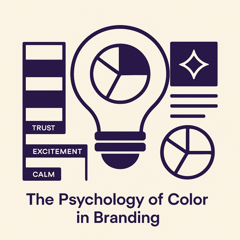
The Psychology of Color in Branding
Colors influence our emotions, perceptions, and behaviors more than we often realize. In branding, the psychology of color is crucial; it shapes consumer connections and brand identities. This article delves into the emotional impact of various colors, guiding businesses and designers on how to apply color theory effectively for a strong brand presence.
The Basics of Color Psychology
Color plays a pivotal role in influencing our emotions and behaviors, forming an essential component of effective branding strategies. Each color evokes specific reactions and establishes an immediate connection with consumers. For instance, the color red is often associated with passion, urgency, and excitement. It can stimulate appetite and increase heart rates, making it a common choice for fast food brands looking to capture quick sales.
Blue, on the other hand, exudes tranquility and trust, often utilized by financial institutions and tech companies to instill confidence and security. This color is synonymous with reliability, appealing to consumers’ desire for safety in their choices.
Yellow invokes feelings of happiness and optimism; its bright hue can attract attention and inspire positivity. Brands that incorporate yellow, such as McDonald’s or IKEA, create an inviting atmosphere that draws consumers in.
Beyond individual colors, context and cultural differences also shape emotional responses to colors. A color that signals joy in one culture may symbolize mourning in another. By strategically employing color theory based on these associations, brands can craft cohesive identities that resonate deeply with their target audiences, reinforcing a lasting emotional connection.
Color Associations and Emotions
Colors evoke deep emotional responses, profoundly impacting consumer perception and brand identity. For example, **red** is often associated with passion, urgency, and excitement, making it a common choice for brands aimed at invigorating action, such as Coca-Cola and Target. **Blue**, in contrast, conveys feelings of tranquility, trust, and professionalism. Brands like Facebook and IBM leverage blue to foster reliability and calm, appealing to consumers’ desire for security. **Yellow** is bright and cheerful, evoking happiness and optimism. Brands such as McDonald’s and Subway use yellow to attract attention and evoke a sense of joy, inviting customers to engage with their products.
These emotional associations can significantly impact consumer behavior, guiding choices and preferences. Other colors, such as **green**, symbolize growth, health, and sustainability, making it popular among environmentally-conscious brands like Whole Foods and Starbucks. Meanwhile, **purple** reflects luxury and creativity, a hue frequently utilized by brands like Hallmark and T-Mobile to convey sophistication.
By understanding these color-emotion connections, businesses can harness color psychology in graphic design and branding strategies to create powerful emotional resonance with their target audience, thereby enhancing their overall brand impact.
The Role of Color in Brand Identity
Color serves as a cornerstone for brand identity, influencing how consumers perceive a brand and fostering an emotional connection. By employing a consistent color palette, businesses can enhance brand recognition, making their products more memorable in a crowded marketplace. For instance, consider the iconic red of Coca-Cola, which not only evokes excitement but also reinforces the brand’s playful and energetic personality. Similarly, Tiffany & Co.’s distinguished robin egg blue symbolizes luxury and sophistication, creating an intrinsic value associated with the brand.
The alignment of color choices with brand values and target audiences is essential. A tech startup might opt for sleek, cool colors like blue and gray to convey trust and professionalism, appealing to a corporate clientele. In contrast, a children’s toy brand might use vibrant colors like red, yellow, and green to foster a sense of joy and creativity.
Leading brands have mastered this art, employing color psychology to cultivate a strong brand identity. Nike’s use of black instills power and sophistication, while green in Whole Foods effectively communicates a commitment to health and sustainability. By strategically selecting and maintaining their color palettes, brands solidify their place in consumers’ minds, reinforcing loyalty and encouraging advocacy.
Color Theory in Graphic Design
Color theory is an essential tool in graphic design, as it guides designers in creating compelling visuals that resonate with audiences. Key concepts such as complementary, analogous, and triadic colors are fundamental to this process. **Complementary colors** are opposite each other on the color wheel, like blue and orange; they provide high contrast and draw attention, making them effective for branding elements requiring visibility. **Analogous colors**, which sit next to each other, create harmony and a cohesive look. For instance, green, yellow-green, and yellow can evoke a calm and soothing ambiance, ideal for brands in the wellness sector.
Using **triadic color schemes**, which involve three colors evenly spaced around the wheel, offers vibrancy and balance. Brands like Fanta have successfully utilized this concept to convey excitement through their energetic palettes. The psychological impact of these choices is significant; a well-thought-out color combination can influence perceptions and emotions, ultimately shaping consumer behavior. As designers grasp these principles, they can craft visually appealing graphics that not only engage but also foster meaningful connections with their intended audience, aligning aesthetics with the brand’s identity and emotional messaging.
Leveraging Color for Emotional Design
The strategic use of color in emotional design is crucial for brands aiming to create impactful experiences. By understanding the psychological associations tied to different colors, brands can evoke specific emotional responses that resonate deeply with consumers. For instance, warm colors like red and orange can stimulate excitement and urgency, making them ideal for promotions or sales, while cooler colors such as blue and green foster a sense of calm and trust, suitable for brands focused on health or security.
To leverage these principles effectively, businesses should incorporate emotional design techniques across various platforms. In advertising, color can be used to highlight key messages and drive engagement; a vibrant palette in a digital ad can invoke energy, while muted tones in luxury marketing can convey sophistication. In product design, thoughtful color choices can enhance the user experience, such as using bright colors for children’s toys to invoke joy and playfulness.
Furthermore, in user interfaces, color should guide user actions. Using contrasting colors for call-to-action buttons ensures they stand out, prompting users to engage. Ultimately, brands that master the strategic use of color in emotional design will create memorable experiences that forge lasting connections with their audience.
Best Practices for Implementing Color Strategies
Color strategy implementation is crucial for businesses aiming to foster strong brand identities and emotional connections with consumers. To begin, it’s essential to choose a color palette that aligns with your brand’s core values and emotional goals. Start by identifying the emotional response you wish to evoke—consider the psychological associations of each color. For example, blue may suggest trust and professionalism, while red can ignite passion and urgency.
Once potential colors are identified, create a harmonious palette that combines these colors in a way that resonates with your audience. Implementing a triadic or analogous color scheme can generate visual interest while maintaining coherence. It’s vital to think about how colors will look in various media, including digital platforms and print, as perception can vary significantly across contexts.
Testing is an integral part of the color implementation process. Engage in A/B testing with different color combinations on marketing materials or product designs, gathering feedback from target consumers. This iterative approach allows you to refine your choices, ensuring they evoke the desired emotional reactions. Remember, collecting insights and adapting your strategy accordingly will maximize your branding efforts and enhance overall effectiveness.
Conclusions
In conclusion, understanding the psychology of color can transform the way brands connect with consumers. By leveraging the emotional associations tied to specific colors, businesses can create compelling identities and memorable experiences. Implementing these insights into branding strategies can effectively enhance brand recognition and foster deeper emotional connections with the audience.